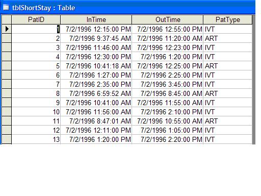
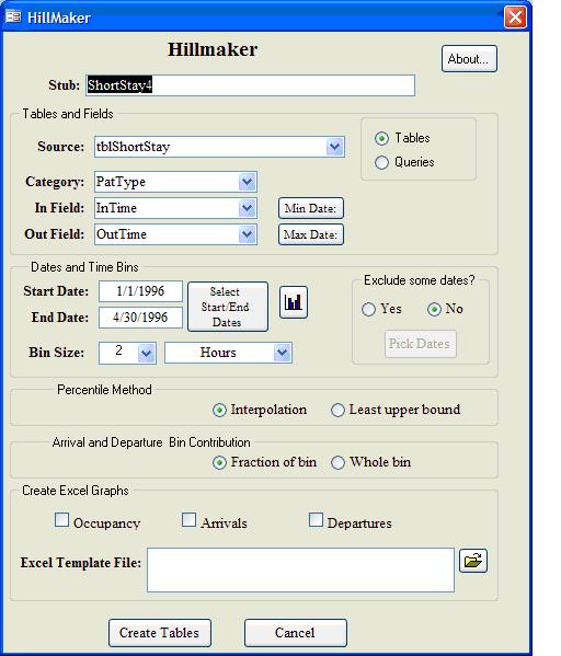
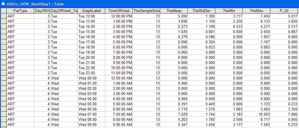
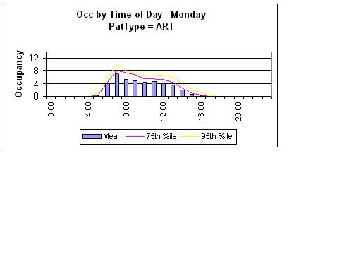
Patients flow through a Short Stay Unit for a variety of procedures, tests or therapies. Let's assume patients can be classified into one of five categories of patient types: ART (arterialgram), CAT (post cardiac-cath), MYE (myelogram), IVT (IV therapy), and OTH (other). From one of our hospital information systems we were able to get raw data about the entry and exit times of each patient. A portion of the input data table is shown in Figure 1. We'd like to create a graph that shows the total average and 95th percentile of occupancy and the number of arrivals by time of day and day of week. Hillmaker is designed for precisely this problem. In Figure 2 you can see the Hillmaker main form. Figure 3 shows part of the summary output table from Hillmaker that will allow us to create such a graph. You can't see them in the screen shot, but the 50th, 55th, ..., 95th percentiles are included as fields off to the right in the table. Figure 4 shows the occupancy graph for Monday that was created the Excel based grapher that comes as a part of Hillmaker.
Figure 1. A small part of the raw data table


Figure 3. Part of the occupancy day of week summary output
 Top
Figure 4. Sample occupancy graph
 Top
Top